Customizing ThoughtSpot Settings with Custom Charts
With custom charts, you can fully customize ThoughtSpot settings by defining visualPropEditorDefinition.
This definition can be:
- A static object
- A dynamic function (useful for pre-processing based on
currentVisualPropsandChartModelin the SDK)
Additionally, ChartModel includes an optional parameter, activeColumnId, which allows for column-level settings Guide Link.
Key Considerations
- When called for the first time, currentVisualProps is empty.
- VisualProps contains key-value pairs(with keys as defined in visualPropEditorDefinition) that define the current values of ThoughtSpot components.
- Dynamic configurations allow custom settings based on ThoughtSpot's existing chart properties.
Example: Dynamic Custom Visual Editor
Let's take a scenario where you want an editor with:
- A toggle switch.
- A ThoughtSpot radio component that is only displayed when the toggle is set to
true.
Implementation:
(async () => {
  const ctx = await getChartContext({
    // Other parameters such as chart name
    visualPropEditorDefinition: (
      currentVisualProps: ChartModel,
      ctx: CustomChartContext
    ): VisualPropEditorDefinition => {
      const { visualProps } = currentVisualProps;

      const elements = [
        {
          key: "color",
          type: "radio",
          defaultValue: "red",
          values: ["red", "green", "yellow"],
          label: "Colors",
        },
        {
          key: "tooltipconfig1",
          type: "tooltipconfig",
          defaultValue: { columnIds: [] },
          label: "ToolTip",
        },
        {
          type: "section",
          key: "accordion",
          label: "Accordion",
          children: [
            {
              key: "datalabels",
              type: "toggle",
              defaultValue: false,
              label: "Data Labels",
            },
          ],
        },
      ];

      // Conditionally add an element based on the toggle state
      if (visualProps?.length !== 0) {
        if (visualProps?.accordion?.datalabels) {
          elements[1].children?.push({
            key: "Color2",
            type: "radio",
            defaultValue: "blue",
            values: ["blue", "white", "red"],
            label: "Color2",
          });
        }
      }

      return { elements };
    },
    // Other parameters
  });
})();
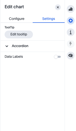
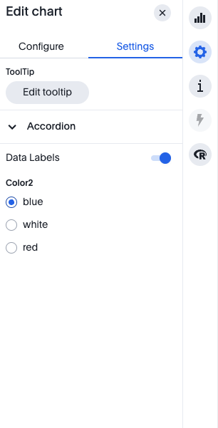
Expected Behavior
- When the toggle is turned on, the Color2 radio component appears.
- When the toggle is off, Color2 is hidden.
- You can modify settings dynamically based on chartModel, such as axis configuration.
UI Preview
Before
After
Property Element Descriptions
Here is the list of element that are currently supported by the visualProp:
| Property Element | Description |
|---|---|
Section | Defines a collapsible section in the UI. |
TextInputFormDetail | A text input field for entering string values. |
NumberInputFormDetail | A numeric input field for entering number values. |
ColorPickerFormDetail | A color selection tool for setting colors. |
ToggleFormDetail | A toggle switch for enabling/disabling options. |
CheckboxFormDetail | A checkbox for selecting multiple values. |
RadioButtonFormDetail | A set of radio buttons for selecting one value. |
DropDownFormDetail | A dropdown list for selecting from multiple options. |
There is property to disable for each prop element that can be defined parallel to key property of each element link to api reference.
Additional Notes
- Dynamic property customization can be done using values in chartModel, such as
axisConfig. - This approach allows real-time adjustments to the visual editor UI based on ThoughtSpot chart settings.
Adding column level settings with TS-chart-sdk
To add column level settings the visualPropEditorDefinition should be defined with activeColumnId as a parameter.
Based on this activeColumnId we can provide column level settings in to different columns.
activeColumnId is currently is a optional parameter for visualPropEditorDefinition to provide backward compatibility.
Below is the code sample to add column level settings to a column with id column1.
(async () => {
  const ctx = await getChartContext({
    // Other parameters such as chart name
    visualPropEditorDefinition: (
      currentVisualProps: ChartModel,
      ctx: CustomChartContext,
      activeColumnId: string
    ): VisualPropEditorDefinition => {
      const elements = [];
      const columnsVizPropDefinition = [];
      // other globalsettings level logic to manipulate element as seen above.
      if (activeColumnId === "column1") {
        // column level logic
        columnsVizPropDefinition.push({
          type: ColumnType.Atrribute,
          column1: {
            // column id
            elements: [
              {
                key: "color",
                type: "radio",
                defaultValue: "red",
                values: ["red", "green", "yellow"],
                label: "Colors",
              },
            ],
          },
        });
      }
      return { elements, columnsVizPropDefinition };
    },
    // Other parameters
  });
})();
So in the above example you can see we are returning columnVizPropDefinition along with elements to define column level settings. The columnVizPropDefinition is an array of objects with columnId and type as key and elements as value.
If column id changes and the new column id is not present in the columnVizPropDefinition then the column level settings then this may break column level settings.